Overview
Our group was tasked with creating recommendations to improve the website for "Lastman's Bad Boy". Lastman's Bad Boy is a one-stop superstore for all home needs such as appliances, electronics, furniture and décor.
Problem Definition
How might we improve the user experience on Lastman's Bad Boy website, so that the users don't get frustrated while shopping online?
Our Approach
We approached this problem with comprehensive research. Our optimization recommendations and research are based on heuristic, competitive analysis.
Research
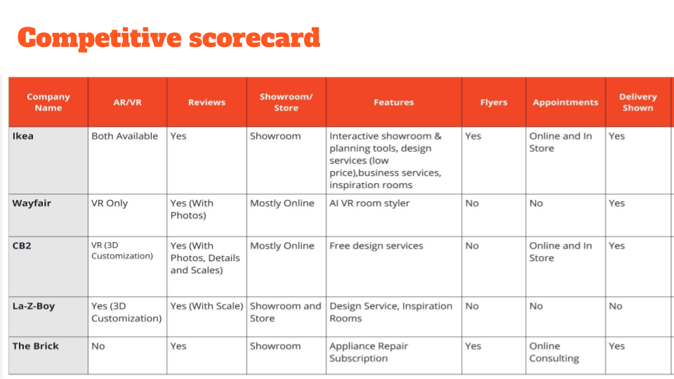
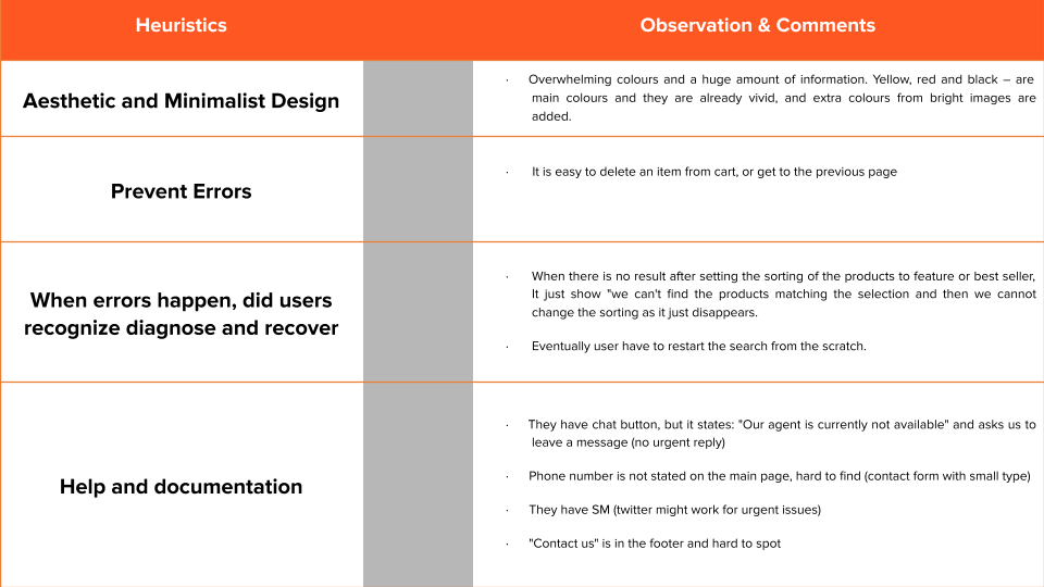
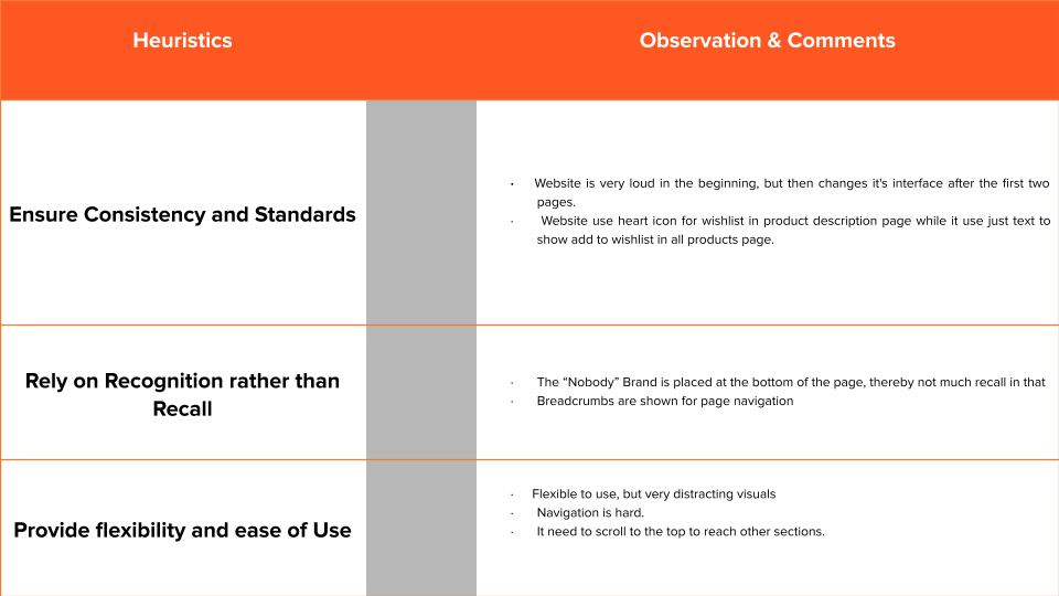
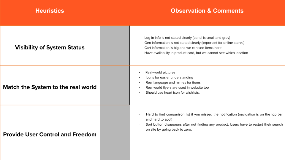
Current State analysis
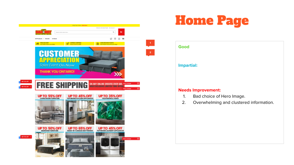
Solution (Recommendations)
Colour Scheme: Use calmer colours that won't overwhelm the users the moment they enter the website.
Banner: The first banner could be a photo with a simple text introduction, that highlights the company's strengths.
Flyers: Stressing on only one element instead of all of them would create less cognitive load for users, and also help users prioritize information.
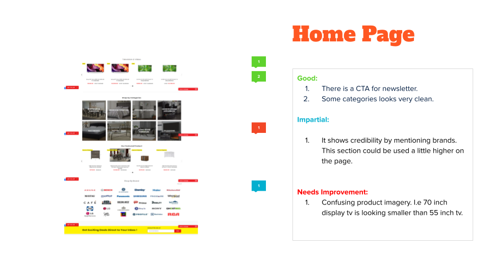
Brands and Categories: Should be placed at the top to help users navigate better, instead of being at the bottom.
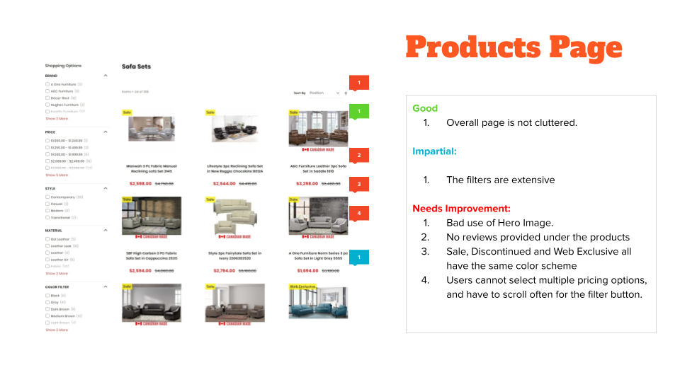
Sorting: There should be a sorting option that performs the intended function. Also, errors should be highlighted properly for the user.
Ratings: Star ratings should be added under the products.
Label Color: Differentiating colours between sales, sold out, express delivery, etc.
should be used.
Hero images: Hero Images should be used better and with a CTA embedded in it.
Fixed Filter and navigation: The filter and navigation buttons should be fixed and move along on the screen as the users scroll.
Price Range Filter: The price range filter should give freedom to the user to choose multiple price ranges.
Thank you for Checking the project!